
The Custom Interfaces group in the question palette holds 22 mobile-first, tactile plugin question types. Each one is built on top of a native question type (single choice, ranking, matrix, and so on) — so your existing logic, piping, carry-forward, and export handling keep working. The plugin only changes how the question renders and is answered, not how it's stored.
Every plugin question shows a live, tappable preview right inside the builder, so you can try the interaction before opening the full preview tab.
How to read this page#
Each entry lists:
- Built on — the native question type it stores its answer as (this matters for logic operators and exports).
- What it does — the respondent-facing interaction.
- Key settings — the researcher-facing knobs in the properties panel (not exhaustive — open the Settings tab on the question for the full list, or see that plugin's individual guide for the complete settings reference).
Shared conventions across several matrix-based plugins: row/column display as image vs. text vs. both (e.g. on Brand Projection, Time Based Rating, Multi Select Multi Tap) is controlled by one shared Questions Display tri-state control in the Settings tab rather than a dedicated per-plugin toggle — if you don't see a separate "show as image" switch on one of these, that's why.
Fast Select#
Full guide: Fast Select →
Built on: Single choice
A quick-tap single-choice interface for touch. Options render as large cards; tapping one can auto-advance the respondent to the next question.
Key settings: Selection type (single/multiple), auto-advance on selection, what each card shows (image, text, or both), card columns and padding, font size (desktop/mobile), instructions-in-popup toggle.
When to use it: Mobile-first studies, A/B image picks, quick screening questions — anywhere every extra tap matters.
Tap & Drag Rank#
Full guide: Tap & Drag Rank →
Built on: Ranking
Respondents tap items to include them in their ranking, then drag to reorder. Items they don't tap stay in an unranked pool — so a respondent can partially rank without being forced to rank everything.
Key settings: Advance automatically once the max number of selections is reached, an optional "review your ranks before advancing" confirmation step, re-rank prompt text, card columns/padding, font size.
When to use it: Ranking studies where not every item is relevant to every respondent, or where classic drag-to-rank is fiddly on mobile.
Group Rank (Thumbnail Rank)#
Full guide: Group Rank (Thumbnail Rank) →
Built on: Ranking
A two-panel thumbnail layout: respondents assign items into ranked bucket groups instead of a single ordered list.
Key settings: Column number, maximum selections, what each thumbnail shows, font size (desktop/mobile).
When to use it: Style/preference studies where you want visual thumbnails ranked into groups (e.g., "top pick", "also like") rather than a strict 1-to-N order.
Directional Swipe#
Full guide: Directional Swipe →
Built on: Matrix
A card-swipe interface — each item is a card, and each swipe direction (left/right, up/down) maps to a matrix column. Respondents swipe cards one at a time, Tinder-style.
Key settings: Which directions are active, swipe overlay opacity, card tilt while dragging, stack depth and direction, card width, desktop-only button alternatives to swiping, what each card shows.
When to use it: Rapid concept sorting (accept/reject/maybe), product or ad testing, or any matrix where a one-card-at-a-time tactile experience beats a traditional grid.
Constant Sum (plugin)#
Full guide: Constant Sum (plugin) →
Built on: Constant sum
The same allocate-to-a-total logic as the native Constant Sum question, with a touch-optimized entry UI: a running total in a bottom bar, long-press-to-max, and percentage/currency formatting. Two layouts: List (one item per row, the default) or Grid (item cards in columns, as in the Qualtrics Constant Sum Grid).
Key settings: Layout (List / Grid; Grid adds mobile and desktop columns, +/- on each card or a popup counter, and choice / instruction text length), enforce total / cap at max total, currency symbol or "show as percentage", decimal places, max digits, long-press-to-max duration, mobile scroll hint text, item randomization (the same options as Multiple Choice).
When to use it: Budget-allocation or share-of-wallet questions on mobile, where the desktop constant-sum grid is too fiddly to tap through.
Multigrid Sequential Carousel#
Full guide: Multigrid Sequential Carousel →
Built on: Matrix
Presents each concept in its own carousel slide, and within that slide walks the respondent through a sequence of rating scales — so a large matrix becomes a guided, one-concept-at-a-time flow.
Key settings: Text alignment (concept and options), heading and option font sizes, option icons on/off.
When to use it: Rating many concepts across several scales without showing an overwhelming full grid at once.
Sequential Select#
Full guide: Sequential Select →
Built on: Matrix
Brands are presented one at a time as a slide, and the respondent taps a card grid to place that brand into an answer bucket before advancing to the next slide. Three modes control what happens after a pick: Single (a picked brand disappears, and unpicked brands are recorded against a system "None of these" column), Multiple (picked brands carry forward and can be picked again on later slides), and Reverse funnel (looks single-select but records the brand cumulatively on every slide after it's first picked).
Key settings: Selection mode (single/multiple/reverse funnel), grid columns (desktop/mobile), fit-to-screen, card text alignment, Next / "None of these" / confirm button labels, min/max selection validation messages.
When to use it: Brand-by-brand sequential exercises (e.g., "which segment does each brand belong to?") where showing one brand per slide reduces cognitive load versus a single big matrix.
Claim Multi Tap#
Full guide: Claim Multi Tap →
Built on: Matrix
Respondents tap each criterion 1 to 4 times, where the number of taps encodes intensity (e.g., one tap = somewhat important, two taps = very important, three taps = critical). A 2-tap or 3-tap variant controls how many intensity levels are available.
Key settings: Matrix type (2-tap or 3-tap), max taps per criterion, show text alongside choice icons, concept image area size (percent of the shared vertical space).
When to use it: Feature-importance or satisfaction batteries where a single tap-count gesture communicates intensity faster than a radio scale.
Multi Select Multi Tap#
Full guide: Multi Select Multi Tap →
Built on: Matrix
Respondents tap once to select an item, tap again to escalate it to a stronger selection — capturing two scale points per item with one gesture, across a grid of items.
Key settings: Grid columns (desktop/mobile), include a "none of these" button, instructions-in-popup, delay before the next tap registers, text alignment, fit-to-screen, font size (base + desktop adjustment).
When to use it: Attribute or claim lists where you want a lightweight "select vs. strongly select" distinction without a full intensity scale.
Carousel Grid (Sequential Statement Choice)#
Full guide: Carousel Grid (Sequential Statement Choice) →
Built on: Matrix
Respondents swipe through statements one at a time and pick a column answer for each, instead of scanning a full grid.
Key settings: Answer/statement alignment and sizing (percent of viewport per section), zoom-thumbnail toggle, font sizes for question/statement/choice/swiper.
When to use it: Long statement batteries where a full matrix would feel overwhelming on a small screen.
Info Icon Augment#
Full guide: Info Icon Augment →
Built on: Multiple choice
A standard choice list where each option can carry an info icon that opens a short explanatory popup — useful when option labels need a definition before the respondent can answer confidently. Configured from the regular Multiple Choice settings plus a per-option info-popup field on the answer list.
When to use it: Feature or attribute lists where some terms need a one-line definition (e.g., industry jargon, product feature names).
Simple Icon Grid#
Full guide: Simple Icon Grid →
Built on: Matrix
Respondents rate concepts across criteria using tappable icon scales instead of radio buttons or a text grid.
Key settings: Icon mode, layout mode, number of scale points, criteria rows shown per screen, auto-advance, font sizes.
When to use it: Emotion/agreement scales where icons (faces, stars, thumbs) communicate faster than labels, especially with lower-literacy or multilingual audiences.
Brand Projection#
Full guide: Brand Projection →
Built on: Matrix
Respondents associate brands with concepts by tapping to "project" a brand up or down against a criterion — a top/bottom projection interaction rather than a rating scale.
Key settings: Projection variant, min/max selections, allow deselect, tap-selected-item-to-remove-rank, concept area height, text alignment.
When to use it: Brand-fit or brand-association exercises where you want a fast tap interaction instead of a full matrix of scale points.
Time Based Rating#
Full guide: Time Based Rating →
Built on: Matrix
An animated rating bar that fills over a set duration per statement or metric — the respondent stops it (or it auto-completes) to register a rating tied to timing as well as position.
Key settings: Rating scale and variant (bar/stars), number of stars (if star variant), animation/progress/pip speed, precision, "show positives only", concept area size, question text alignment.
When to use it: Studies that want a reaction-time or intensity signal alongside the rating itself, or a more engaging alternative to a static scale.
Agreement Double Tap#
Full guide: Agreement Double Tap →
Built on: Matrix
Tap once to agree, tap a second time to register "strongly agree" — collapses a 2-point intensity signal into a single tap gesture per statement.
Key settings: Slide layout, items per slide, randomize/shuffle items within each slide group, font size (base + desktop adjustment), instructions-in-popup toggle.
When to use it: Long agreement batteries on mobile, where a full 5-point radio row per statement is too much friction.
Bipolar Double Tap#
Full guide: Bipolar Double Tap →
Built on: Matrix
Respondents pick a side (A or B) for each statement, then tap a second time to indicate "strongly" — producing a 5-point bipolar scale (strong A, A, neutral, B, strong B) from two taps.
Key settings: Randomize A/B positions, timing between taps, font size (base + desktop adjustment), instructions-in-popup toggle.
When to use it: Semantic-differential or "which pole are you closer to" batteries where a bipolar scale communicates better than an agreement scale.
Multi Swipe#
Full guide: Multi Swipe →
Built on: Matrix
Respondents swipe (or tap) right to increase and left to decrease a running score for each statement against a concept, up to a configured range — recorded as one signed count per statement.
Key settings: Scoring scale/range, statements shown per screen, concept height, left/right icon URLs, tap-to-zoom concept.
When to use it: Fast concept-scoring exercises where a directional gesture (more/less of an attribute) is more natural than a numeric scale.
Instruction Swiper#
Full guide: Instruction Swiper →
Built on: Text / Graphic (display-only — no answer is collected)
A set of full-screen instruction slides the respondent swipes through before continuing. Each slide is rich text/HTML; nothing is recorded and the question never blocks on a required answer.
Key settings: Desktop slide width, mobile scroll arrow visibility.
When to use it: Multi-step onboarding or task instructions that are too long for a single Text/Graphic block.
Timed Instruction#
Full guide: Timed Instruction →
Built on: Text / Graphic (display-only)
Shows a confirm popup ("Let's Go"), then displays an image for a fixed duration with a visible countdown, auto-advancing when time runs out. No answer is collected.
Key settings: Image duration, image container width.
When to use it: Brief-exposure concept tests where you want to control exactly how long a respondent can view a stimulus before moving on.
Dial Gauge Grid#
Full guide: Dial Gauge Grid →
Built on: Matrix
A half- or full-circle dial gauge with press-and-hold +/− buttons; respondents set a 0–100% value per statement by holding the button instead of dragging a slider or typing a number.
Key settings: Gauge style, gauge size, statement font size (desktop/mobile), question text position, fit-to-screen.
When to use it: Percentage-estimate questions ("what share of your workforce...") where a dial feels more tactile than a numeric field or slider row.
5-Point Single Select#
Full guide: 5-Point Single Select →
Built on: Single choice
A vertical scale rendered with a sliding "window" highlight, moved by large +/− buttons instead of tapping individual radio options directly.
Key settings: Where the +/− buttons sit, sliding-window animation duration, concept image height, choice/answer font size, max question width.
When to use it: Single-select rating questions on mobile where large, deliberate +/− taps reduce mis-taps compared to a tight radio list.
MaxDiff (plugin render)#
Built on: the native maxdiff type — same item/column/Follow Up Question editors, analysis, and export as the standard MaxDiff question. The plugin only swaps in a touch-optimized respondent widget.
See the dedicated MaxDiff (Best–Worst Scaling) guide for full configuration — design of experiment, screens & items, Best/Worst columns, Top-N Bandit, and the Follow Up Question.
Shelf Choice#
Full guide: Shelf Choice →
Built on: Conjoint — the same answer storage and export as a Conjoint question, but the design is built for each respondent, so there is no matrix lock, design upload or DOE library. It sits in the Choice Modeling palette group.
Respondents shop a store shelf: they open a product close up, choose a quantity and click Purchase, or click Buy None. One purchase per shelf; the survey moves on by itself after the last shelf.
Key settings: six fixed attributes (Product, Price % and $ adjustments, Promotion active, Promotion % and $) with editable levels; shelf columns, maximum quantity and price rounding (Settings tab); every button and popup text (Messages tab). The design of experiment is built for each respondent from the current attributes: the DOE tab has only screens and products per screen, and the survey publishes with no lock or generate step. Export Response in the Fielding dashboard downloads one respondent's shelves as an Excel file.
When to use it: Shopper, price and promotion studies where the purchase quantity matters.
Simplified Shelf Choice#
Full guide: Simplified Shelf Choice →
Built on: Constant sum (one number per product: the quantity bought, 0 for shown but not bought, -99 for not shown). Listed in Choice Modeling.
A virtual store shelf. Respondents tap pack shots, add products to a cart and check out, or press Buy None.
Key settings: shelf rows and columns, Single or Multiple selection, max quantity per product, shelf background, currency, keep groups together; an opt-in random product draw under Randomization.
When to use it: Shelf, pack, range or price tests where respondents should see the products side by side, as in a store.
Online Choice#
Full guide: Online Choice →
Built on: Conjoint — the same answer storage and export as a Conjoint question, and, like Shelf Choice, a design built for each respondent, so there is no matrix lock, design upload or DOE library. It sits in the Choice Modeling palette group, after Simplified Shelf Choice.
Respondents shop an online store's product list: they open a product's Buy window from its image or Add To Cart, choose a quantity, optionally tick the repeat (subscribe) box and click Buy — or click the full-width Next (Buy None Of These) button under the list to buy nothing on that screen. At most one purchase per screen; the survey moves on by itself after the last screen.
Key settings: nine fixed attributes (Product, Price % and $ adjustments, Promotion, Shipping message, Repeat message, Rating and review count adjustments, Sponsorship) with editable levels; unit label and maximum quantity (Settings tab); every button and label text (Messages tab). The DOE tab has only screens and products per screen, and the survey publishes with no lock or generate step. Export Response in the Fielding dashboard downloads one respondent's screens as an Excel file.
When to use it: E-commerce price, promotion, shipping, rating and sponsored-placement studies where quantity and repeat purchase matter.
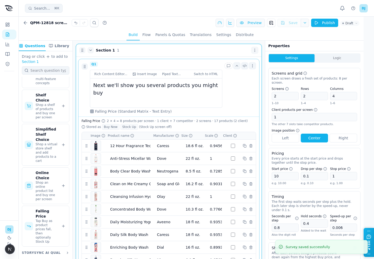
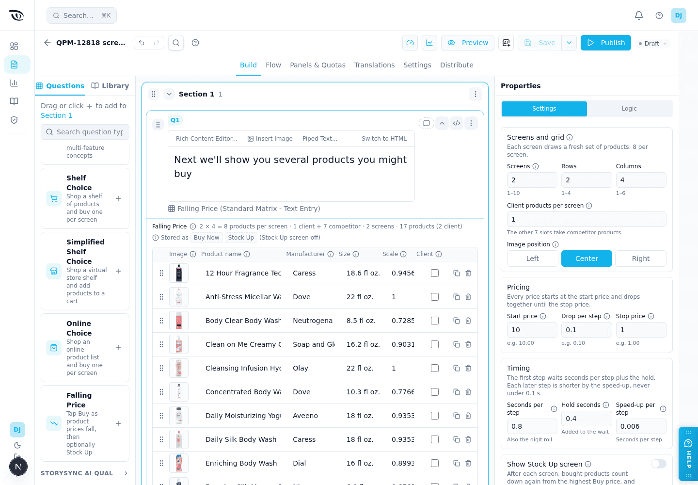
Falling Price#
Built on: Matrix text entry. Each product is a row, and there are two fixed columns, Buy Now and Stock Up. Each cell saves a price such as $ 7.40, or $ 0.00 for a product that was shown but not bought. It sits in the Choice Modeling palette group, last.
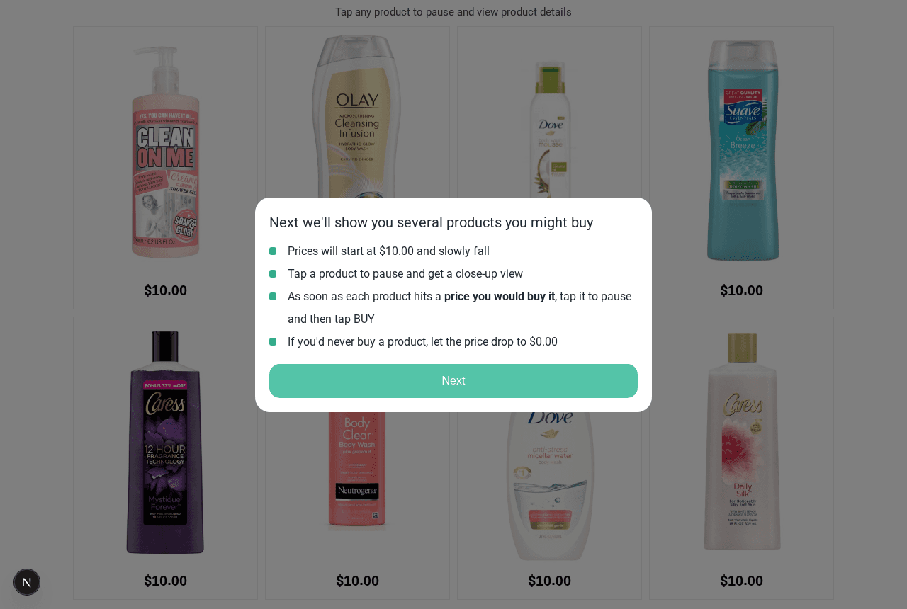
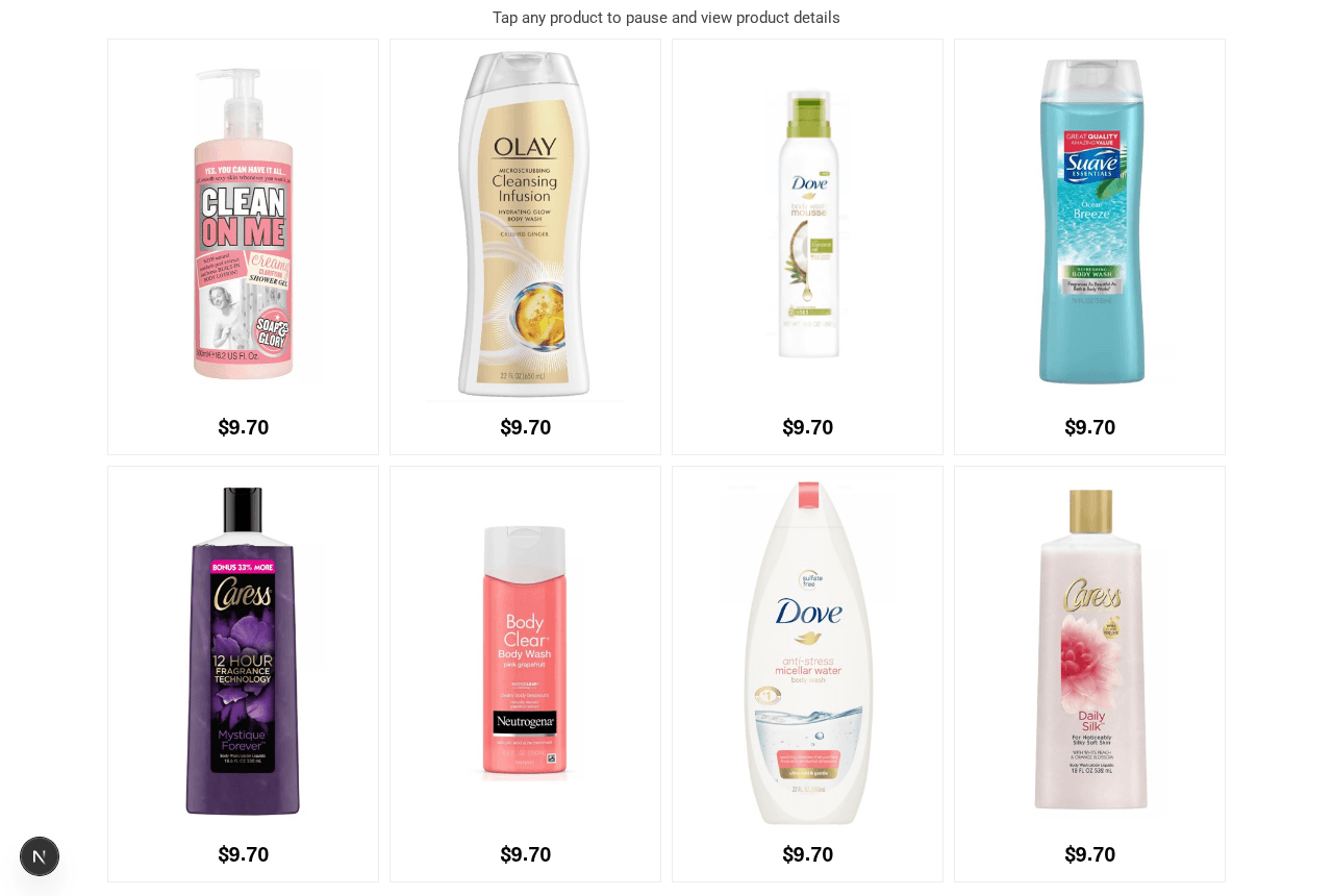
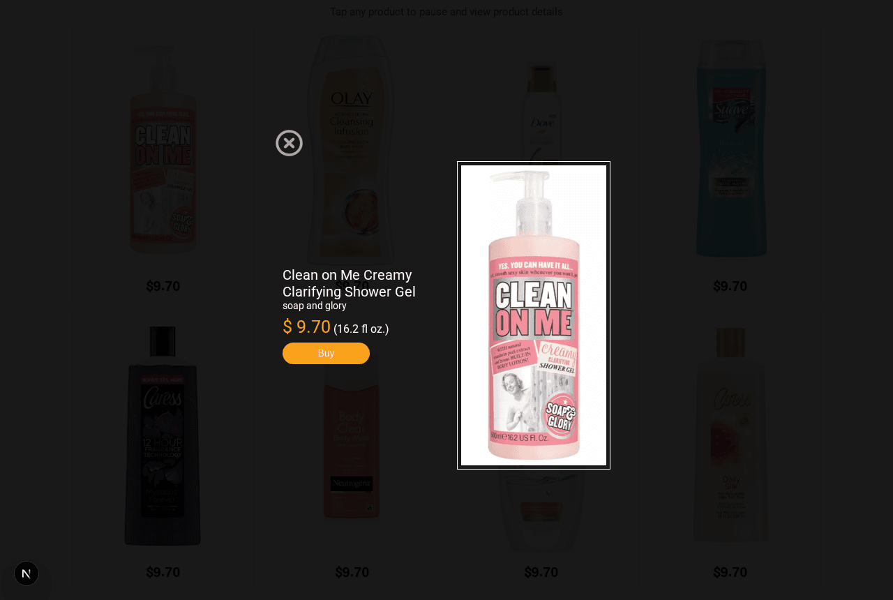
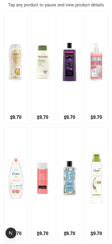
Respondents see a grid of products whose prices fall together. They tap a product to pause every price and see it close up, then tap Buy at the price they would pay. A product never bought falls to the stop price. The exercise runs over several screens, each drawing a fresh mix of client and competitor products. With Show Stock Up screen on, each screen is followed by a second one where every bought product counts down again from the highest Buy price, and respondents tap Stock Up at the price they would buy several. The survey moves on by itself after the last screen.
Key settings: screens, rows and columns of the grid, client products per screen, image position, start price, price drop per step, stop price, seconds per step, hold and speed-up (Settings tab); Show Stock Up screen (off by default). Products are edited on the question card: image, name, manufacturer, size, image scale and a Client tick. Paste Qualtrics rows reads product rows such as Body Clear Body Wash | Neutrogena | 8.5 fl oz. | 0.73 | <img src="…">. A new question starts with a 17-product body-wash example.
The instructions are fixed English text; the question text is their heading. The Buy button reads Comprar when the survey variable Q_Language is ES. A question with a product missing its name or image, or with settings that contradict each other, saves but cannot be published until it is fixed.
When to use it: Price sensitivity studies where you want each respondent's own buy price, and optionally their stock-up price, for your products next to competitors'.
Related guides#
- Question Types — overview and when-to-use table
- StorySync AI Qual — voice, video, and AI-moderated interview formats
- Display Blocks & Plugins — Text/Graphic and global-variable blocks
- Logic, Flow & Conditions — plugin base types, ranking and matrix operators
- Platform Feature List — plugin inventory and status
- Qualtrics QSF Import & Export — importing plugin questions
Was this page helpful?