
The Constant Sum plugin is a Custom Interfaces format built on the constant sum base type. It's a distinct plugin storage twin from the native Constant Sum question documented in Grid & Allocation Questions — same allocate-to-a-total concept, but with a touch-optimized entry UI.
What respondents see#
A running total in a bottom bar and a grid of items respondents tap or press-and-hold to increment toward a shared total. Values can render as a plain number, a percentage, or with a currency symbol.
The items can be laid out two ways: as a List (one item per row, the default) or as a Grid of cards in columns. See Layout: List or Grid.
When to use it#
- Budget-allocation or share-of-wallet questions on mobile, where the desktop constant-sum grid is too fiddly to tap through.
Configuring it in the builder#
Drag Constant Sum from the Custom Interfaces group in the question palette. Items are authored the same way as the native Constant Sum question's rows. Plugin-specific behavior lives in the question's Settings tab.
Layout: List or Grid#
The Layout choice sits at the top of the Settings tab.
- List (default): one item per row. Every existing Constant Sum question is a List, and stays exactly as it was.
- Grid: the items as cards in columns, the same layout as the Qualtrics Constant Sum Grid. Use it when you have many items, or image items, and want respondents to see several at once.
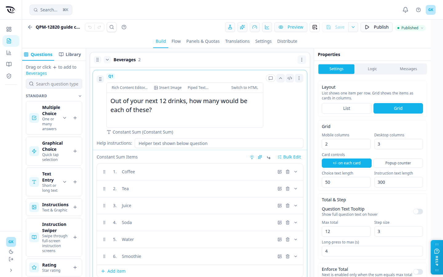
What respondents see in Grid
- Cards in columns: 2 across on phones and 3 on desktop by default. An item with an image shows only its image on the card, as in the Qualtrics Grid. An item without an image shows its text; long text is shortened with "..." and the shortened text shows on hover.
- Either + and − buttons on each card or, if you pick Popup counter, a tap on a card opens a small counter with + and − and the "Tap or Press & Hold" hint. A card with a value then shows its count in a badge.
- Arrows above and below the cards when there are more cards than fit on screen. Each tap scrolls two rows.
- The running total in the bottom bar, always shown: "x/100" when Total enforced is on, otherwise just "x".
- The instructions in a popup that opens about a second after the page loads (by default), with an Instructions button to reopen them. When the instructions are on the page instead, hovering over them shows the full instruction text, even if it was shortened and even if Question text tooltip is off.
- Respondents change values only with + / − or press-and-hold; they can't type a number into a Grid card.
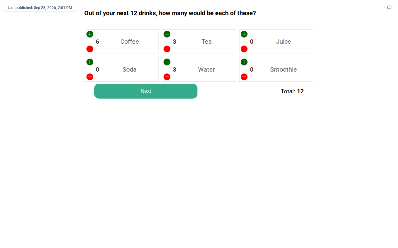
Grid settings (shown only when Layout is Grid)
| Setting | What it controls | Default |
|---|---|---|
| Mobile columns | Cards per row on phones and narrow screens (768px or less) | 2 |
| Desktop columns | Cards per row on desktop | 3 |
| Card controls | +/- on each card, or Popup counter (tap a card to open a counter) | +/- on each card |
| Choice text length | Item text longer than this many characters is shortened with "..." | 50 |
| Instruction text length | On-page instruction text longer than this is shortened with " ..." | 300 |
| Next button text | The Next button's label, edited on the Messages and text tab | Next |
When you switch to Grid, Step size changes to 3, Instructions in popup to Both and Show Tap / Hold Hint to on, to match the Qualtrics Grid. Switching back to List sets them to the List defaults (5, Neither and off) and removes the Grid settings. They go back to the defaults, not to what you had before switching to Grid, so check them if you had changed them.
Settings that don't apply in Grid are hidden while Layout is Grid: Answers to show, Enforce total as maximum (Cap at Max Total), Cap at Each Item, Show total, Currency symbol, Show end decimals, Desktop popup width, Fit to screen, Answers Display, Mobile scroll hint text, Question Text Tooltip (Grid always shows the full instruction on hover), the Input Limits settings (Grid has no typed entry) and, on the Messages tab, Limit validation message (Grid never shows it). Your List values for them are kept and come back if you switch to List. In Grid:
- Every item is shown, and the running total is always shown.
- When Total enforced is off, nothing caps the values: the total can end up below or above Max total.
- The "Tap or Press & Hold" hint appears only inside the popup counter, so it is not shown with +/- on each card.
Settings reference#
These are the List defaults. In Grid, some defaults differ and some settings are hidden; see Layout: List or Grid.
| Setting | What it controls | Default |
|---|---|---|
| Question text tooltip | Shows the full question text as a hover tooltip on the header | Off |
| Max total | The total respondents allocate to | 100 |
| Step size | Increment per tap / long-press tick | 5 |
| Seconds to reach maximum | Long-press duration to traverse 0 → max total | 4 |
| Answers to show | If > 0, only render the first N items | 0 (all) |
| Total enforced | Hide Next until the total equals max total | Off |
| Enforce total as maximum | Hard-clamp each item so the running total can never exceed max | On |
| Show total | Display the running total in the bottom bar | On |
| Show as percentage | Render values as "n%" instead of a plain number | Off |
| Currency symbol | $, £, €, ¥, ₣, ₹, or None (ignored if showing percentage) | None |
| Show end decimals | Force two decimal places | Off |
| Answers display | Image only, text only, or both | Both |
| Instructions in popup | Where the description surfaces (neither/desktop/mobile/both) | Neither |
| Desktop popup width | Instruction popup width on desktop, as a percentage | 60% |
| Press-and-hold hint | Inline "Tap or Press & Hold" instruction text toggle | Off |
| Box padding | Inner padding of each item card (px) | 1 |
| Mobile scroll hint text | Hint shown above the scroll arrows on mobile | Blank |
| Fit to screen | Clamp the scroll area to the viewport | On |
| Font size / desktop adjustment | Base text size + desktop bump | 17px / +4px |
| Max characters / digits | Direct-entry input limits | 300 chars, 8 int / 12 decimal digits |
| Button & message text | Review-instructions label, running-total label, confirm button text, and the max-total-exceeded alert (maxTotal placeholder) — edited on the Messages and text tab | Customizable |
Logic support#
Built on constant sum, so it supports the same allocation-total condition operators as the native Constant Sum question. See Logic, Flow & Conditions.
Each item can have its own display logic. Open the item's dropdown on the Build card and choose Add Display Logic to show the item only when your conditions are met. An item with logic shows a blue logic chip, and you can remove the logic from the same dropdown. A respondent never sees a hidden item. If every item is hidden, the question is skipped. Other questions can also check whether a Constant Sum item Is Displayed or Is Not Displayed.
Other questions can also check whether an item got the most or the fewest points: pick the item, then Is Highest or Is Lowest (in both List and Grid layouts). If several items tie for the most (or fewest) points, the condition is true for each of them. An item with no points recorded (for example, one that was not shown) or an unanswered question is never highest or lowest; an item given 0 points still counts. These work in display and skip logic, answer-option display logic, Flow branches, End of Survey, global variable conditions, auto-answer conditions and quotas. See Display logic → Constant Sum for examples, including how to auto-answer a single-choice question with the top item and break ties at random.
Good to know#
- Auto-answer when only one option is displayed (Logic tab, off by default): when carry-forward or display logic leaves one item, the question is hidden and that item is recorded with the number in Value to record. Leave the box empty to record the question's total (Max Total, 100 by default).
- Don't confuse this with the native Constant Sum question — they share the same underlying data shape but the plugin swaps in a different respondent widget with its own settings.
- List and Grid store answers the same way: one number per item. Only the layout differs. In analysis, a Grid question is reported as the Qualtrics Constant Sum Grid interface and a List question as Constant Sum.
- When Total enforced is off, a respondent can leave every item at 0 and press Next. That counts as an answer, in both layouts.
- If a respondent comes back to a Constant Sum question, it starts again from 0 (or from each item's default value), in both layouts.
Related guides#
- Question Types — overview and when-to-use table
- Custom Interfaces — all 22 custom interface formats
- Grid & Allocation Questions — the native Constant Sum question
- Logic, Flow & Conditions — operators and condition builder
Was this page helpful?