
Text/graphic blocks present content without collecting an answer. Plugin question types and Guided Story add mobile-first and voice-first interfaces on top of standard question bases.
Three blocks on this page collect no answer at all — Instructions, Create Global Variable, and Display Global Variables — and so does one plugin, Landscape / Portrait Instructions. None of them can be made required, none of them takes a question number, and none of them appears in your exported data.
Instructions#
A display-only block — no answer is collected. Use it for instructions, images, or section breaks.
- Text variation — Rich text content respondents read before continuing.
- Graphic variation — Image with optional caption, alignment, and max width.
- Supports display logic and a custom Next button label.
When to use it:
- Section introductions and consent text.
- Stimulus images before a choice or matrix question.
- Break pages between long batteries.
Create Global Variable#
A block that sets one or more global variables at an exact point in your question order, without opening the Flow tab. Respondents see nothing at all: the assignment runs and the survey carries on.
Select the block and open Settings in the properties panel. You get the same Set Variables editor the Flow tab uses — click Add, pick an existing variable or create a new one on the spot, choose Set / Increment / Decrement / Formula, and type the value. You can attach a condition to an assignment so it only fires in certain cases. The condition's question list shows the same question numbers you see on the canvas, and covers only questions that record an answer — blocks like this one, Display Global Variables and Text/Graphic are left out, because a rule about a question nobody answers can never come true.
The assignment keeps up with the page it sits on. If its condition is about a question on the same page, the variable changes as soon as that question is answered, and changes back if the answer changes. Inside a Section Loop, each pass checks its own answers, so a variable set on the first pass does not leak into a pass where the condition isn't met. Pressing Restart in preview starts every variable fresh, the same as a new respondent.
When to use it:
- Tag a respondent mid-section ("everyone who reaches here is a
qualifiedlead") without building a flow block. - Set up a value right before the question that reads it, so the order is obvious on the canvas.
Good to know:
- It is never required and never blocks the respondent. If it is the only thing on a page, the page is passed straight through.
- Save it with no assignments and the builder flags it — an empty block does nothing.
- It carries no question number and is not in your exported data.
- If the section it sits in uses question randomization, the block can be shuffled after a question that depends on it. Keep it out of randomized sections, or pin its position.
See Variables & panel redirects for what global variables are and where else they can be set.
Display Global Variables#
A block that shows a table of every global variable and its current value at that point in the survey. It is a build-and-test aid: nothing is collected, and respondents simply press Next.
| Variable | Value |
|---|---|
| region | EU |
| score | 12 |
| segment | not set |
A variable that has no value yet shows as not set. One setting, Show variables with no value, hides those rows if you would rather only see what has been filled in.
When to use it:
- Watching what your Set Variables blocks, URL parameters, and panel bindings actually produce while you build.
- Handing QA a page that proves the right values reached the right point in the flow.
Good to know:
- It renders wherever the survey runs, including live published links. That is deliberate — you decide where it appears. If you want it in preview only, give it the display-logic rule Mode Is Preview (see Display logic).
- It never blocks Next, is never required, and takes no question number.
- In preview it lists your variables in the order they appear in the Global Variables panel; on a live published link it lists them alphabetically.
Specialized interfaces (plugin question types)#
In addition to standard types, the builder includes 22 Custom Interfaces plugins optimized for mobile and tactile research (tap, swipe, drag, and dial interactions on top of single choice, ranking, and matrix bases), plus 9 StorySync AI Qual formats for voice-, video-, and AI-moderated-interview research. They are listed in the question palette alongside the standard types, in the group that matches what they do: Standard, Specialized, Rank, Matrix, Multi-Matrix or Choice Modeling. Each plugin renders a live, tappable preview right inside the builder.
See the dedicated guides for the full list, respondent behavior, and configuration options:
- Custom Interfaces — Graphical Choice, Tap & Drag Rank, Swipe Matrix, Constant Sum, Dial Gauge Grid, MaxDiff, and 16 more tap/swipe/drag formats.
- Simplified Shelf Choice — a virtual store shelf in Choice Modeling: respondents add products to a cart and check out, or press Buy None.
- StorySync AI Qual — Guided Story, AI-Moderated Interview, Guided Story With Video/Image/NPS-CSAT, Pantry Checker, Tap & Talk, and Slide & Speak.
More plugin types may appear via QSF import or deployment — see the Platform Feature List and Qualtrics QSF Import & Export.
Graphical Choice#
A quick-tap single-choice interface optimized for touch. Answers appear as large tap targets that advance automatically — ideal for "Which one do you prefer?" style questions on mobile.
When to use it:
- Mobile-first studies where every extra tap matters.
- A/B image picks and quick-swipe-style screening.
- Any single-choice question you want to feel frictionless.
Graphical Choice is built on top of single choice — all your existing single-choice logic, piping, and carry-forward options apply. The question-level settings let you control timing, auto-advance behavior, and the image/text display mode.
Tap & Drag Rank#
A touch-friendly ranking interface. Respondents first tap items to include them, then drag to reorder. Non-selected items stay in a pool so respondents can partially rank without being forced to rank everything.
When to use it:
- Ranking studies where not every item is relevant to every respondent.
- Mobile experiences where traditional drag-to-rank is fiddly.
Tap & Drag Rank is built on top of ranking — it uses the same rank-position logic operators as standard ranking questions (see Logic, Flow & Conditions).
Group Rank#
A two-panel thumbnail rank interface. Respondents assign items into ranked bucket groups. Built on the ranking base type.
Swipe Matrix#
A card-swipe interface where each item is a card and each direction (left/right, up/down) maps to a category. Respondents swipe cards one at a time — great for Tinder-style concept testing.
When to use it:
- Rapid concept sorting (accept / reject / maybe).
- Mobile product or ad testing.
- Any grid where you want a tactile, one-card-at-a-time experience instead of a traditional matrix.
Swipe Matrix is built on top of a matrix question, so each card can be categorized into any of the matrix's column values. The settings panel lets you configure the swipe directions, card width, stack depth and direction, the swipe overlay opacity, whether the card tilts as it is dragged, whether on-screen direction buttons are shown, the instruction popup, and an optional Back button.
How far does a respondent have to swipe? This is not something you configure. A card commits as soon as it has travelled half the distance to the edge of the respondent's screen, so the gesture takes the same effort on a small phone as on a desktop. A short nudge still does nothing, so the card can be moved a little to peek at the direction labels without accidentally answering.
Statement Agreements#
A screen-by-screen agreement interface, listed in the Matrix group. The answer options are statements. Respondents see a few statements at a time and tap the one they agree with most on each screen, then move on to the next screen. It is the Survey Builder version of the Qualtrics Agreement Battery interface, and its answers appear under Agreement Battery in HM Admin.
When to use it:
- Agreement batteries where respondents pick the statement that fits them best from small sets.
- Long statement lists you want to break into short, mobile-friendly screens.
What you set up:
- Statements — add them as answer options, in the order you want them grouped. A new question starts with six statements, three per screen.
- In Settings:
- Answer type — Single (the default): one tap picks a statement and moves on automatically. Multiple: respondents can pick several statements on a screen, then press Next.
- Statements per screen — how many statements share a screen. Screens are filled in the order you listed the statements, so the last screen can have fewer.
- Pause before next screen (ms) — how long, in milliseconds, the screen stays in place before the next one slides in, after a pick (Single) or after Next (Multiple). Default 500.
- Back arrow delay (ms) — how long, in milliseconds, after going back before the back arrow updates. Default 250.
- Randomize screen order — shuffles the order of the screens. On by default.
- Statement order options — turns the next two options on or off. On by default.
- Shuffle within screens — shuffles the statements on each screen. Off by default.
- Reverse within screens — reverses the statements on each screen, every time. On by default, which is how the Qualtrics interface behaves.
- In Messages: the Next button label, shown in Multiple mode only.
What respondents see:
- The question at the top and the current screen's statements below it as full-width tiles. A picked tile is highlighted in the survey's theme color.
- Back and forward arrows, plus a Next button in Multiple mode.
- They cannot move on until they have picked something on the current screen, and there is no way to skip a screen. On the last screen, the answer is submitted as soon as they tap (Single) or press Next (Multiple).
- Going back shows their earlier picks highlighted, and they can change them.
Good to know:
- The answer is saved as the list of statements picked, in the order you wrote them, whatever order they were shown in. Logic, piping and carry forward work as they do for a multiple-choice question.
- Do not use the question's own Randomization settings, show only some of the options, or add display logic to individual statements. The interface does its own shuffling, and its screens must follow your written order to line up with the Agreement Battery analysis in HM Admin.
- There is no Validation tab: a pick on every screen is always required.
- Text size has two controls: question text and choice text (the statements).
- In HM Admin, and in the JSON and Word survey downloads, the question text ends with | N, where N is the number of screens. HM Admin needs this; respondents never see it.
- When the statements do not divide evenly into screens, HM Admin can group them differently from what respondents saw. For example, 13 statements at 6 per screen show as 6, 6 and 1, while HM Admin groups them as 5, 5 and 3.
Landscape / Portrait Instructions#
A display-only instructions screen that asks respondents to turn their device, listed in the Specialized group. The Next button stays greyed out until the phone or tablet is held the way you asked for, so respondents reach the next question already in the right orientation. Use it before a wide grid, a video or an image that only works one way round. No answer is collected.
When to use it:
- Before a question that needs a landscape screen — a wide matrix, a shelf image, a video.
- Before a question that needs a portrait screen, such as a tall list or a full-height concept.
What you set up:
- The screen itself — write it in the question's own text box, exactly like an Instructions block. Anything you can put there works: text, formatting and an image, such as a picture of a rotating phone. A new question starts with "Please turn your device sideways to continue."
- In Settings: Required orientation — Landscape (the default) or Portrait. This is the only setting.
- In Messages: the Next button label, and the rotate hint — the short line shown under your instructions while Next is unavailable. The hint starts out as the sentence that matches the orientation you picked, and it follows along if you switch between Landscape and Portrait. Type your own and it stays exactly as you wrote it.
What respondents see:
- Your instructions screen, with the rotate hint and a full-width Next button directly underneath, all centred on the screen, as in the Qualtrics version. If your instructions are longer than the screen, they scroll and Next stays visible at the bottom. There is no Back button on this screen.
- The Next button uses your survey's theme colour, like the rest of the survey.
- Next is greyed out and cannot be pressed until they turn the device. The moment they do, Next lights up and the hint disappears. Turning back greys it out again.
- On a desktop or laptop, Next is available straight away. A monitor cannot be rotated, so gating it would leave people stuck with no way forward — the same is true in the builder's preview pane, where the question always lets you continue.
- A phone with rotation lock switched on cannot satisfy the screen. There is no way to skip past it, so tell respondents to turn rotation lock off in your instruction text if that is a risk for your sample.
Good to know:
- No answer is recorded, on any path. The question takes no question number, cannot be made required, and never appears in your exported data or in analysis — exactly like an Instructions block.
- There is no Validation tab, and there is nothing to carry forward.
- Display logic and Skip Logic (After Question) work normally, and you can pipe earlier answers into the instruction text.
- Text size has one control: question text.
Navigation Tree#
A tree test, listed in the Specialized group. You build a menu, like the navigation of a website or an app, and give respondents a task such as "Where would you go to change your password?". They open the categories and pick the one item where they think the answer lives. You mark which items are correct, so you learn whether people can find things in your menu. It is the Survey Builder version of the Qualtrics Tree Question.
When to use it:
- Testing a website or app menu before you build it, or comparing two versions of one.
- Checking whether your category names make sense to your audience.
What you set up:
- The task — write it in the question's own text box.
- Menu items — build the menu right on the question card. A new question starts with two categories of two items each.
- + Add category adds a top-level category. Hover a row to add a sub-item under it, delete it, or open ⋯ to move it up or down, or to indent or outdent it. You can go up to five levels deep.
- Drag a row by its handle to reorder it within its level.
- Hover an item with nothing under it and click the check to mark it correct. More than one item can be correct. Only items with nothing under them can be picked by respondents, so only they can be correct.
- Keyboard: Tab moves to the next row (and adds one at the end), Enter adds an item below, Alt+↑ / Alt+↓ move an item, Alt+Shift+→ / ← indent and outdent, and Ctrl+Enter (Cmd+Enter on a Mac) marks an item correct.
- Bulk Edit — edit the whole menu as text: one item per line, two spaces of indent per level, and a
*at the end of a correct item. You can also paste a Qualtrics Tree Question string (for exampleInstruction~Investing;Ways to invest;;1|…) and the menu is built for you, with the option to use its instruction as the question text. - In Settings: Show full tree — every category starts open. Leave it off to test how people find their way through the menu.
- In Messages: the Selected path label, the text shown when nothing is selected, and the Next button label.
- In Validation: Require Answer. When it is on, Next stays greyed out until an item is picked.
What respondents see:
- Your task, a "Selected path:" line, and the menu with every category closed (unless Show full tree is on).
- Tapping a category opens or closes it. Tapping an item picks it and shows a check; tapping it again un-picks it. Only one item can be picked at a time.
- A full-width Next button at the bottom. There is no Back button on this screen.
- The menu works with a keyboard and screen readers.
Good to know:
- The answer is saved as one line of text: the time taken, the item picked, every item picked along the way, and whether the final pick was correct. For example
12.345|Investing > Ways to invest|Investing > Advanced trading;Investing > Ways to invest|true. The response detail view shows it as the chosen path with a Correct or Incorrect label; exports keep the full line. - Labels cannot contain
|,;or>, and two items under the same category cannot share a name. The builder points out any label that breaks these rules. - Answers store the item names, so renaming an item after your survey is live changes how new answers read compared with earlier ones.
- If a respondent goes back and returns, the menu starts fresh, and their next pick replaces the earlier answer.
- Display logic and Skip Logic (After Question) work normally. There is no randomisation for this question.
- Piping this question into later text inserts the whole saved line, and conditions on it use the text operators (for example, contains
|trueto branch on a correct answer). - HM Admin receives the answer line, but its Quant Analysis does not chart tree tests yet.
- Text size has two controls: question text and menu item text.
Tip: Plugin questions render a built-in preview inside the builder so you can try the interaction without opening the full preview tab.
Pick, Group & Rank#
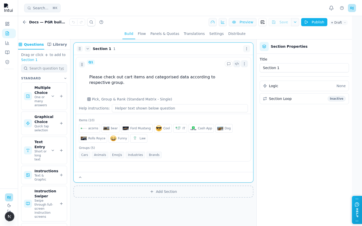
A card sort, listed in the Specialized group. Respondents drag each item into one of your named groups, for example sorting brands, animals and emojis into Cars, Animals, Emojis, Industries and Brands. You can also ask them to put the items in each group in order. It is the Survey Builder version of the Qualtrics Pick, Group, and Rank question.
When to use it:
- Learning how people categorise products, brands, features or ideas in their own heads.
- Finding the favourites within each group, when you turn on ranking.
What you set up:
-
The instructions — write them in the question's own text box. Respondents see them in a pop-up when the page opens, and again from the Instructions button.
-
Items — the cards to sort, edited on the question card like matrix rows. Each item can have an image. A new question starts with 10 image items.
-
Groups — where the cards go, edited on the question card like matrix columns. A group is a plain-text name. A new question starts with five groups.
-
Bulk Edit on Items takes one item per line. It also takes Qualtrics choice lines such as
Cash App|<img src="…">, which become the item name and its image. -
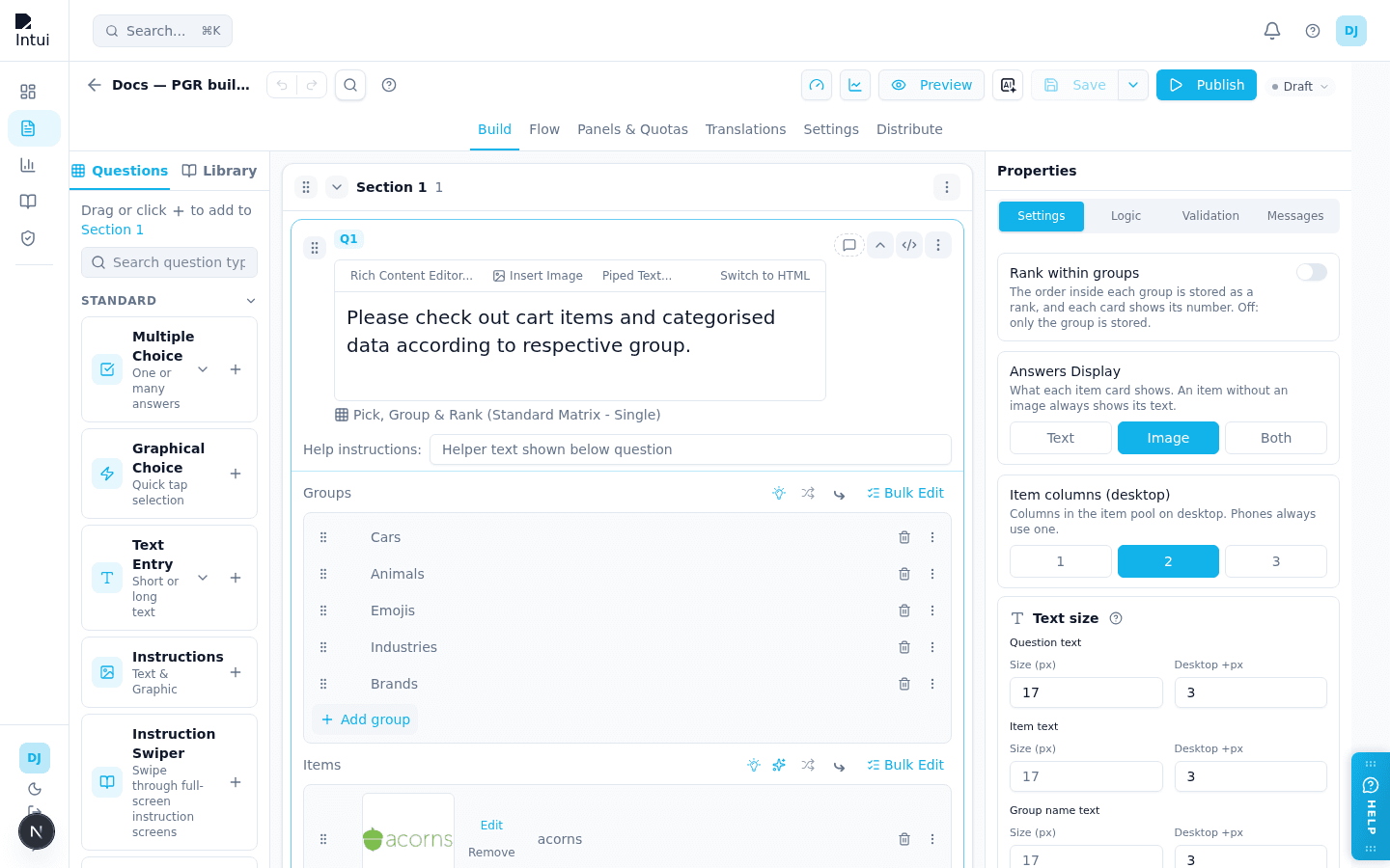
In Settings:
- Rank within groups — the order inside each group is saved as a rank (1, 2, 3 …), and each card shows its number. Off by default.
- Answers Display — whether a card shows the Text, the Image (the default) or Both. An item without an image always shows its text.
- Item columns (desktop) — 1, 2 or 3 columns of cards in the pool. Phones always use one.
-
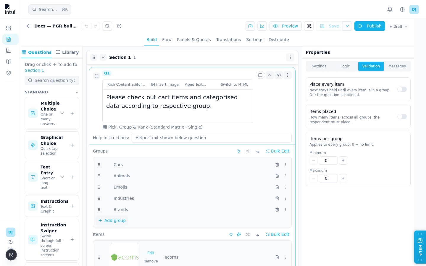
In Validation (all off by default, so the question is optional):
- Place every item — Next is held until every item is in a group.
- Items placed — the fewest and most items the respondent must place in total.
- Items per group — the fewest and most items any one group may hold.
-
In Messages: the Next and Instructions buttons, the text shown when every item is placed, the "+N more" label on phones, and the message shown when Next is tapped before the rules are met.
What respondents see:
- On a computer, the cards on the left and the groups stacked on the right. On a phone, the cards and the groups side by side, each group showing up to four thumbnails and "+N more".
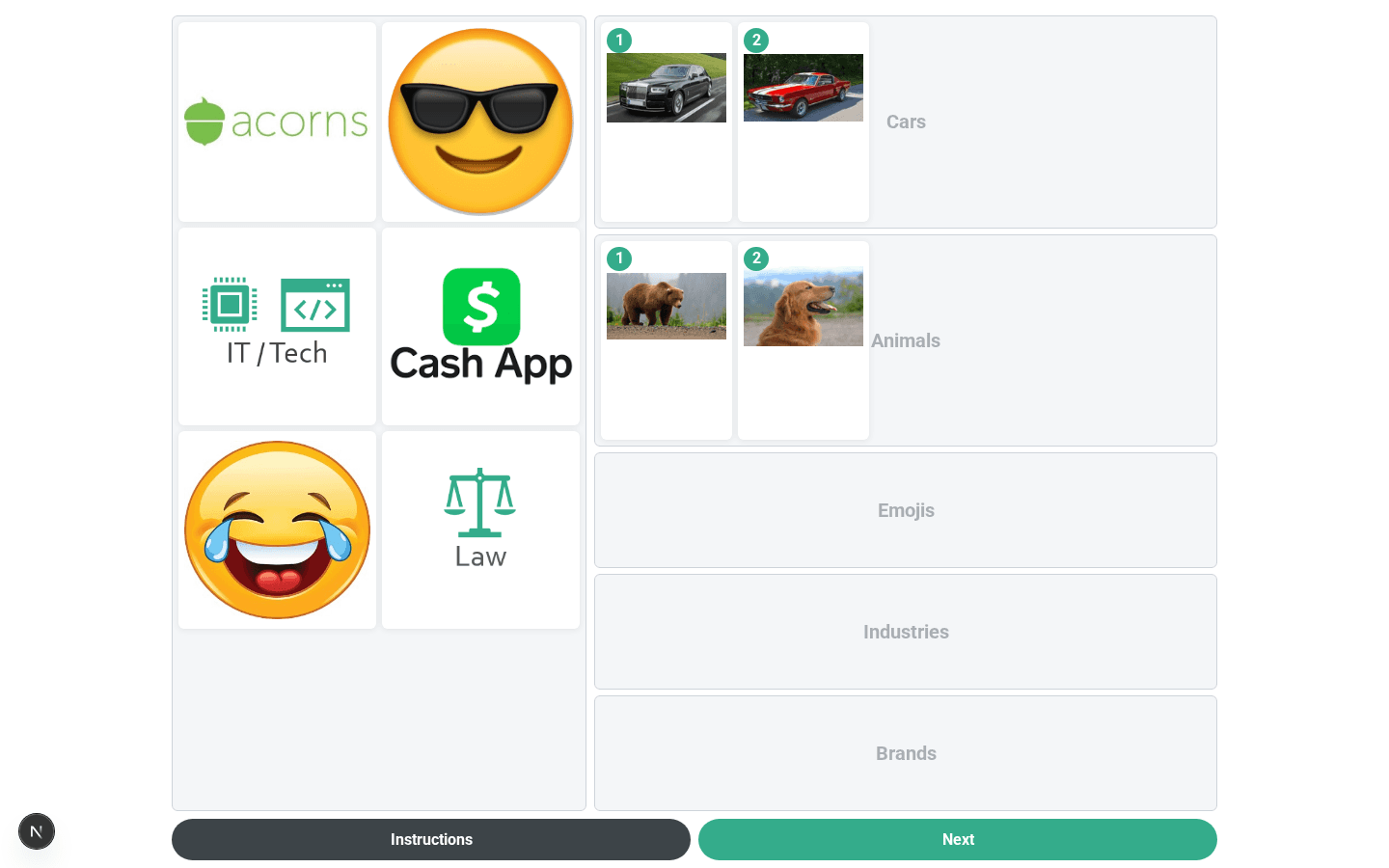
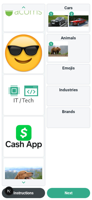
- They drag a card into a group, or tap a card and then tap a group. Cards can be moved between groups, reordered inside a group, or dragged back.
- On a phone, tapping a group opens it as a list, where its cards can be reordered or sent back.
- With ranking on, each card in a group shows its number, which updates as cards move.
- The page works with a keyboard and with screen readers.
Good to know:
- Each item is saved with two values: its group and its rank in that group. With ranking off, the rank is left empty. Items the respondent did not place have both left empty.
- Exports and the Web Service payload have two columns per item,
Q5_1_GROUP(the group's recode value) andQ5_1_RANK(the rank). The response detail view shows a table of item, group and rank. - If a respondent goes back and returns, the board starts fresh, and their next move replaces the earlier answer.
- Display logic and Skip Logic (After Question) work normally. Other questions can check whether this one was answered or was displayed. Conditions on a particular item or group, piping, carry forward and loops from this question are not available yet.
- Item randomisation uses the usual row randomisation. Groups always appear in the order you set.
- HM Admin does not receive this question's answers yet, and its Quant Analysis does not chart it. The answers are stored and exported in full.
- Text size has three controls: question text (the pop-up), item text and group name text.
Sequential Select — "Other, please specify" on a brand#
On a Sequential Select question, any brand can be marked Allow Text Input from that brand's ⋮ menu, turning it into an "Other, please specify" option. Require Text in the same menu makes typing something mandatory. Once a brand is marked, a Text entry prompt field appears alongside the question's other messages so you can word the popup.
What the respondent sees:
- Tapping the brand opens a popup asking them to type their answer. Confirm selects the brand; closing the popup leaves it unselected.
- The card then shows what they typed in place of its image and label, shrinking the text to fit the card and cutting it off with "…" if it is very long. In multiple-select mode the card stays on screen for the following slides, so they keep seeing their own answer.
- Tapping the brand again on a later slide re-opens the popup with their earlier answer filled in. Closing it, or confirming without a change, keeps that answer; only editing it changes it. Clearing it puts the card back to the original brand.
What you get:
- Later questions use what they typed, not "Other brand". Piping, carry-forward, Section Loops over the brands, and the response detail view all show "Sensodyne Pronamel" — including when the brand was carried into a later question, whose answer the response detail view, the summary email and web-service payloads name the same way.
- Your export gets both: the brand's own column, unchanged, plus a companion
_TEXTcolumn with the typed value — see Response Export.
This is only offered on Sequential Select. Other grid questions and interfaces do not have it.
Other plugin types#
Additional plugins (sequential select, icon grid, brand projection, constant-sum plugin UI, info-icon augment, and others) are documented in the engineering platform docs and often arrive via Qualtrics QSF import. See Qualtrics QSF Import & Export.
Guided Story (StorySync)#
Guided Story is a voice-first question format that turns open-ended feedback into a guided conversation. The respondent speaks their answer, the system transcribes and structures it, and you get a rich narrative response back.
When to use it:
- Customer research where written answers feel too formal.
- Mini in-depth interviews at scale (Mini IDI workflows).
- Any open-ended question where you'd normally want a voice note.
Adding a Guided Story#
From the question palette, open the Story group and drag Guided Story onto your canvas. A configuration wizard opens where you can set up the full narrative — the wizard handles the question text, prompts, and expected response shape, so you don't need to hand-write everything in the main canvas.
How it looks to respondents#
Respondents see a clear prompt and a large microphone button. When they tap it, they can speak their response naturally. A transcript appears live as they speak, and they can re-record before moving on. The full question text (built from the wizard) is shown above the recorder so expectations are clear.
Related Story formats#
The Guided Story wizard also powers a set of related formats:
- Guided Story + Segmentation — Voice narrative plus single/multiple-choice follow-ups in the same frame.
- Camera Video Story — Video response instead of voice-only.
- Image Capture Story — Photo upload with optional narrative.
- NPS / CSAT Story — Wrap an NPS or CSAT prompt with a spoken follow-up for context.
- Mini IDI — A short, guided interview flow of multiple Story prompts.
The primary entry point in the palette is Guided Story; other Story formats are configured through the same StorySync wizard (segmentation, video, image capture, NPS/CSAT story, Mini IDI).
Related guides#
- Question Types — overview and when-to-use table
- Custom Interfaces — mobile-first tap/swipe/drag plugin formats
- StorySync AI Qual — voice, video, and AI-moderated interview formats
- Logic, Flow & Conditions — plugin base types, ranking and matrix operators
- Platform Feature List — plugin inventory and status
- Qualtrics QSF Import & Export — importing plugin questions
- Choice Questions — standard single and multiple choice
Was this page helpful?